class: center, middle, inverse, title-slide .title[ # Data Visualization/Plotting ] .author[ ### Zulquar Nain ] .institute[ ### AMU ] .date[ ### 2025-05-16 ] --- <style type="text/css"> .code-bg-red .remark-code, .code-bg-red .remark-code * { background-color:red!important; } </style> --- class: inverse, center, middle background-image: url("images/data-visualization.jpg") background-size: cover # Plotting [Image:BoldBI](https://www.boldbi.com/blog/data-visualization-importance-and-benefits) --- # Visualization **Data visualization** is the process to transform the information (data) into a visual presentation for example graph. -- <!-- Visualisation / Plotting is one of greatest strength of `R` --> <!-- -- --> Why `visualisation/Plotting`? -- An image speaks louder than words -- Data visualizations make data easier for the human brain to understand -- visualization also makes it easier to detect patterns, trends, and outliers in groups of data -- Good data .color[visualizations] should place meaning into complicated datasets so that their message is clear and concise. -- <ru-blockquote>According to Tableau, “[data visualization is] one of the most useful professional skills to develop. The better you can convey your points visually, the better you can leverage that information.”</ru-blockquote> --- class: middle # <span style ="color:red">Visualization/Ploting in `R`</spand> -- Visualisation / Plotting is one of greatest strength of `R` -- Limited scope of this course -- -- Basic plot function in `R` is `plot()` Each ***graph*** function has - number of options -- ***grpahical parameters*** `par()` --- class: center, middle # <span style ="color:red">Ingredients for plotting</spand> -- .left[Data] Materials to visualise that is data. No data no visualisation! -- .left[Mapping: Contextual relationship] Mapping depends on what YOU want to show! --- # Data -- Import -- We have learned in previous lectures -- ## Mapping -- We will learn! -- A basic graph -- ``` r plot(cars$speed, cars$dist, pch = 19, col = 'red', las = 1, xlab="speed", ylab="Distance", main = "Speed Vs Distance") ``` <!-- --> --- # Plotting- Setting ### We will use inbuild data sets in `R` -- ### To view available datasets in `R` Type `data()` and execute -- ### We will primarily use `data(cars)` -- ### Most used function for plotting in `R` is `plot()` -- .center[] --- # Data-Cars ``` r data(cars) ``` -- ### Examining the data -- Do you remember? `head()` ; `tail()` ; `nrow()` -- .pull-left[ ``` r head(cars, 2) ``` ``` ## speed dist ## 1 4 2 ## 2 4 10 ``` ``` r tail(cars, 2) ``` ``` ## speed dist ## 49 24 120 ## 50 25 85 ``` ] -- .pull-right[ ``` r ncol(cars) ``` ``` ## [1] 2 ``` ``` r str(cars) ``` ``` ## 'data.frame': 50 obs. of 2 variables: ## $ speed: num 4 4 7 7 8 9 10 10 10 11 ... ## $ dist : num 2 10 4 22 16 10 18 26 34 17 ... ``` ] --- # Let's start- `Plot()` `data(cars)` contains two variables `speed` and `distance` -- ### First plot Plotting speed and distance -- .pull-left[ ``` r plot(cars$speed,cars$dist) ``` <img src="25_Lecture-8-R-Base-Plot_files/figure-html/unnamed-chunk-7-1.png" style="display: block; margin: auto;" /> ] -- .pull-right[ * Here, `cars$speed` is for `x-axis` and `cars$dist` is for `y-axis` * In `cars$speed`, `cars` is name of the data file and `speed` is variable name * `plot()` is command to plot ] --- # Let's start- `Plot()` ### Second plot -- ``` r # output-location: fragment x <- seq(-pi,pi,0.1) plot(x, sin(x)) ``` <img src="25_Lecture-8-R-Base-Plot_files/figure-html/unnamed-chunk-8-1.png" style="display: block; margin: auto;" /> -- * Here `x` is for `x-axis` (a generated data using `seq` command ) * `sin(x)` is for `y-axis` --- # Let's start- `Plot()` ### Adding label and Title ``` r plot(cars$speed, cars$dist, * xlab = "Speed", ylab = "Distance", main = "Speed Vs Distance" ) ``` <img src="25_Lecture-8-R-Base-Plot_files/figure-html/unnamed-chunk-10-1.png" style="display: block; margin: auto;" /> -- * Here to add the label, we have added the highlighted codes. * Names of the label should always be in `""` --- # Let's start- `Plot()` ### Changing Color and Plot Type * We can change the plot type with the argument `type` .pull-left[ ``` r "p" - points "l" - lines "b" - both points and lines "c" - empty points joined by lines "o" - overplotted points and lines "s" and "S" - stair steps "h" - histogram-like vertical lines "n" - does not produce any points or lines ``` ] .pull-right[ ``` r plot(x, sin(x), main="The Sine Function", ylab="sin(x)", *type="l" ) ``` <img src="25_Lecture-8-R-Base-Plot_files/figure-html/unnamed-chunk-12-1.png" style="display: block; margin: auto;" /> ] --- # Let's start- `Plot()` ### Changing Color and Plot Type * Similarly, we can define the colors using `col="color name"` -- ``` r plot(cars$speed, cars$dist, xlab = "Speed", ylab = "Distance", main = "Speed Vs Distance", * col="red" ) ``` -- <img src="25_Lecture-8-R-Base-Plot_files/figure-html/unnamed-chunk-14-1.png" style="display: block; margin: auto;" /> -- * See the highlighted part of the code --- # Some Baisc Graphs ### R Bar Plot -- * Let's assume `AR` contains data of .red[average rainfall] in a day of a week. -- ``` r AR <- c( 12, 15, 11, 16, 18, 15, 14 ) ``` ``` r barplot(AR) ``` <img src="25_Lecture-8-R-Base-Plot_files/figure-html/unnamed-chunk-16-1.png" style="display: block; margin: auto;" /> -- * There are many other parameters can be added to `barplot()` * Use `?barplot()` to explore --- # Some Baisc Graphs ### R Bar Plot -- * Some of the parameters are added here. -- ``` r barplot(AR, *main = "Average rainfall in a Day", *xlab = "Centimeters (cm)", *ylab = "Day", *names.arg = c("Mon", "Tues", "Wed", "Thu", "Fri", "Sat", "Sun"), *border="blue", *col="red", *density=20, *horiz = TRUE, *cex.names = .8)#To change the size of label ``` -- * See the highlighted codes * Output in .red[next slide] --- # Some Baisc Graphs ### R Bar Plot -- * Some of the parameters are added here. -- <img src="25_Lecture-8-R-Base-Plot_files/figure-html/unnamed-chunk-18-1.png" style="display: block; margin: auto;" /> --- # Some Baisc Graphs ### Bar Plot of Categorical Data -- * For example marks out of 20 of ten students in Math is in vector `MM` ``` ## [1] 17 16 18 17 18 19 18 16 18 18 ``` -- * Simple bar plot -- <img src="25_Lecture-8-R-Base-Plot_files/figure-html/unnamed-chunk-21-1.png" style="display: block; margin: auto;" /> * Does it serve pupose? -- * No --- # Some Baisc Graphs ### Bar Plot of Categorical Data .small[ * First convert the data into categorical representation using `table()` * Check out `?table()` ] .code60[ ``` r table(MM) ``` ``` ## MM ## 16 17 18 19 ## 2 2 5 1 ``` ] -- .pull-left[ ``` r *barplot(table(MM), main="Marks of 10 Students", xlab="Marks", ylab="Count", border="blue", col="red", density=10 ) ``` ] -- .pull-right[ <img src="25_Lecture-8-R-Base-Plot_files/figure-html/unnamed-chunk-24-1.png" style="display: block; margin: auto;" /> ] --- # Some Baisc Graphs ### Bar Plot of Categorical Data #### Some more Bar plot -- .code70[ ``` r print(titanic_surv) ``` ``` ## train.Pclass ## train.Survived 1 2 3 ## 0 80 97 372 ## 1 136 87 119 ``` ] .font60[ * Here, 1, 2, and 3 represents 1st, 2nd and 3rd class in the train * 0 and 1 is for the passenger did not survived and survived respectively in the Titanic mishap ] .code60[ ``` r *barplot(titanic_surv, main = "Survival of Each Class", xlab = "Class", ylab = "No of Passenger", col = c("red","green") ) legend("topleft", c("Not survived","Survived"), fill = c("red","green") ) ``` ] --- # Some Baisc Graphs ### Bar Plot of Categorical Data #### Some more Bar plot <img src="25_Lecture-8-R-Base-Plot_files/figure-html/unnamed-chunk-28-1.png" style="display: block; margin: auto;" /> --- # Some Baisc Graphs ### Histogram-`hist()` -- .font60[ * Histogram is a visual representation of the distribution of a dataset * We will use the `data(AirPassengers)` in built in `R` * Explore the function `hist()` using `?hist()` * A Basic Histogram ] .font80[ .left-column[ * put the name of your dataset in between the parentheses like `hist(AirPassengers)` * Histogram for a specific variable can be drawn as `hist(datasetName$VariableName)` ] ] -- .right-column[ .code70[ ``` r hist(AirPassengers) ``` <img src="25_Lecture-8-R-Base-Plot_files/figure-html/unnamed-chunk-30-1.png" style="display: block; margin: auto;" /> ] ] --- # Some Baisc Graphs ### Histogram-`hist()` * Other parameters of `hist()` .code70[ .pull-left[ ``` r hist(AirPassengers, main="Histogram for Air Passengers", xlab="Passengers", border="blue", col="green", * xlim=c(100,700), * las=1, * breaks=5) ``` ] .pull-right[ <img src="25_Lecture-8-R-Base-Plot_files/figure-html/unnamed-chunk-32-1.png" style="display: block; margin: auto;" /> ] ] -- .font80[ * `xlim=c()` & `ylim=c()` fixes the range of `X` and `Y` axes * Inside `c()` sets starting and ending points * `las=1` rotates the label of `Y-axis` Checkout `?las` * `breaks` is for the size/width of `Histogram BINS` Chechout `?breaks` ] --- # Some Baisc Graphs ### Pie Chart-`Pie Chart` -- * Pie chart is drawn using the `pie()` function in `R` programming * This function takes in a vector of .red[non-negative] numbers. * Basic Syntax of is `pie(x, labels, radius, main, col, clockwise)` .content-box-blue[ .font80[ * .red[x] is a vector containing the numeric values used in the pie chart. * .red[labels] is used to give description to the slices. * .red[radius] indicates the radius of the circle of the pie chart.(value between −1 and +1). * .red[main] indicates the title of the chart. * .red[col] indicates the color palette. * .red[clockwise] is a logical value indicating if the slices are drawn clockwise or anti clockwise. ] ] * Explore `?pie()` --- # Some Baisc Graphs ### Pie Chart-`Pie Chart` -- .font70[ * In `pie()`, `scores$Obt.Marks` is the vector of positive numbers for which `pie-chart` is drawn * `scores$Subjects` is the labels * Note: `scores$Subjects` shows that `Subjects` variable has been selected from`scores` dataset ] .code60[ .pull-left[ * `Pie Chart` ``` r pie(scores$Obt.Marks, scores$Subjects) ``` <img src="25_Lecture-8-R-Base-Plot_files/figure-html/unnamed-chunk-34-1.png" style="display: block; margin: auto;" /> ] ] .code70[ .pull-right[ * Data ``` r print(scores) ``` ``` ## Subjects Obt.Marks ## 1 Math 70 ## 2 Eng 80 ## 3 Urdu 60 ## 4 Sc 80 ## 5 Soc. 90 ``` ] ] --- .font80[ # Some Baisc Graphs ### Pie Chart-`Pie Chart` ### Other parameters ] .code70[ ``` r *piepercent<- round(100*(scores$Obt.Marks)/sum((scores$Obt.Marks)), 1) # %age calculation *pie(scores$Obt.Marks, labels = piepercent, # Labels * main = "Scores pie chart", # Title of chart * col = rainbow(length(scores$Obt.Marks))) # Color of chart *legend("topright", # legend position * scores$Subjects, # legend labels * cex = 0.8, # size of legend texts * fill = rainbow(length(scores$Obt.Marks))) # legend color ``` ] <img src="25_Lecture-8-R-Base-Plot_files/figure-html/unnamed-chunk-37-1.png" style="display: block; margin: auto;" /> --- # Some Baisc Graphs ## Scatterplot Matrix * In case of more than two variables and to find the correlation between one variable versus the remaining ones * we use scatterplot matrix. `pairs()` function creates matrices of scatterplots. * `pairs(formula, data)` * We will use `data(mtcars)` available within `R`; explor `?mtcars` ``` ## mpg cyl disp hp drat wt qsec vs am gear carb ## Mazda RX4 21 6 160 110 3.9 2.620 16.46 0 1 4 4 ## Mazda RX4 Wag 21 6 160 110 3.9 2.875 17.02 0 1 4 4 ``` ``` r pairs(~wt+mpg+disp+cyl,data = mtcars, main = "Scatterplot Matrix") ``` * Plot in the next slide --- # Some Baisc Graphs ## Scatterplot Matrix <img src="25_Lecture-8-R-Base-Plot_files/figure-html/unnamed-chunk-40-1.png" style="display: block; margin: auto;" /> * Plot in the next slide --- # Multiple Plots .font80[ ## R Function `par()` * For drawing multiple graphs in a single plot- use `par()` * Checkout `?par()` ] -- .font80[ ### Let's take an example ] -- .font80[ * For drawing two graphs in one plot ``` r par(mfrow=c(1,2)) # set the plotting area into a 1*2 array (1 Row and 2 Col) *barplot(scores$Obt.Marks, names.arg = scores$Subjects, main="Barplot", las=2) # Bar plot *pie(scores$Obt.Marks, scores$Subjects, main="Piechart", radius=1) # Pie Chart ``` * See the graph in next slide ] -- * Here parameter `mfrow` used to specify the number of subplot we need. -- * It takes in a vector of form `c(m, n)` which divides the given plot into `m*n` array of subplots. -- * For the above example, to plot the two graphs side by side, we have `m=1` and `n=2`. --- # Multiple Plots ## R Function `par()`- Explore it for more control parameters <img src="25_Lecture-8-R-Base-Plot_files/figure-html/unnamed-chunk-43-1.png" style="display: block; margin: auto;" /> --- # Saving / Exporting Graph * All types of graphs `(bar plot, pie chart, histogram)` etc. can be saved. * Graphs can be saved as bitmap image( i.e. .png, jpeg, tiff etc) which are fixed size * Graphs can be also saved as vector image (.pdf, .eps) which are easily resizable * We will use the `temperature` column of built-in dataset `airquality` --- # Saving / Exporting Graph ## Saving as `.jpeg` .code110[ .pull-left[ ``` r jpeg(file="saving_plot1.jpeg") # File name hist(Temp, col="darkgreen") dev.off() # TO call off ``` ] ] .pull-right[ .center[Saved Graph] .center[  ] ] -- * Image will be saved in `working/default directory` * we need to call the function `dev.off()` after all the plotting, to save the file and return control to the screen * The resolution of the image by default will be `\(480\times480\)` pixel. --- # Saving / Exporting Graph ## Saving as `.png` .pull-left[ ``` r png(file= "saving_plot2.png", *width=600, height=350) hist(Temp, col="gold") dev.off() ``` ] .pull-right[ .center[Saved Graph] .center[  ]] * You can specify the full path tp save the image at desired plcae (as above) * You can also specify the resolution at desired level using arguments `width` and `height` --- # Saving / Exporting Graph ## Saving as `.bmp` * Size of the plot can be specified in different units such as in inch, cm or mm with the argument `units` and ppi with `res`. * The following code saves a bmp file of size `6x4 inch` and `100 ppi`. .pull-left[ .code110[ ``` r bmp(file="saving_plot3.bmp", width=6, height=4, units="in", res=100) hist(Temp, col="steelblue") dev.off() ``` ] ] .pull-right[ .center[Saved Graph] .center[  ]] --- # Saving / Exporting Graph ## Saving as `.pdf` ``` r bmp(file="saving_plot4.pdf", width=6, height=4, units="in", res=100) hist(Temp, col="violet") dev.off() ``` -- .center[Saved Graph] .center[  ] --- # Plotting in `R` -- * This presentation is not exhaustive. -- * Adopt learning by doing approach -- * Make use of `Google` and `R Documentation` -- * It was about basic `R` plotting -- * Plotting has become more exciting and easy using `package-ggplot2` in `R` -- <img src="25_Lecture-8-R-Base-Plot_files/figure-html/unnamed-chunk-53-1.png" style="display: block; margin: auto;" /> --- # Some More Basic Grpahs ## Histogram and Density Plot -- * Simple Histogram -- .pull-left[ .code110[ ``` r hist(mtcars$mpg, * breaks = 10,col="red") ``` ] * The option breaks= controls the number of bins. ] -- .pull-right[ <img src="25_Lecture-8-R-Base-Plot_files/figure-html/unnamed-chunk-56-1.png" style="display: block; margin: auto;" /> ] --- # Some More Basic Grpahs ## Histogram and Density Plot -- * Histograms can be a poor method for determining the shape of a distribution because it is so strongly affected by the number of bins used. -- * Kernal density plots are usually a much more effective way to view the distribution of a variable -- .pull-left[ .code110[ ``` r d <- density(mtcars$mpg) # returns the density data plot(d) # plots the results ``` ] ] -- .pull-right[ <img src="25_Lecture-8-R-Base-Plot_files/figure-html/unnamed-chunk-59-1.png" style="display: block; margin: auto;" /> ] --- # Some More Basic Grpahs ## Dot Plots -- .pull-left[ .code110[ ``` r dotchart(mtcars$mpg, labels=row.names(mtcars), cex=.7, main="Gas Milage 4 Car Models", xlab="Miles Per Gallon") ``` ]] -- .pull-right[ <img src="25_Lecture-8-R-Base-Plot_files/figure-html/unnamed-chunk-62-1.png" style="display: block; margin: auto;" /> ] --- # Some More Basic Grpahs ## Dot Plots -- * Dotplot: Grouped Sorted and Colored -- * Sort by mpg, group and color by cylinder -- .pull-left[ .code110[ ``` r *x <- mtcars[order(mtcars$mpg),] # sort by mpg *x$cyl <- factor(x$cyl) # it must be a factor x$color[x$cyl==4] <- "red" x$color[x$cyl==6] <- "blue" x$color[x$cyl==8] <- "darkgreen" dotchart(x$mpg,labels=row.names(x),cex=.7,groups= x$cyl, main="Gas Milage for Car Models\ngrouped by cylinder", xlab="Miles Per Gallon", gcolor="black", color=x$color) ``` ]] -- .pull-right[ <img src="25_Lecture-8-R-Base-Plot_files/figure-html/unnamed-chunk-65-1.png" style="display: block; margin: auto;" /> ] --- # Line Plot ## A basic Line Plot .pull-left[ .code110[ ``` r x <- 1:10 # Create example data y1 <- c(3, 1, 5, 2, 3, 8, 4, 7, 6, 9) plot(x, y1, type = "l", main = "This is my Line Plot", xlab = "My X-Values", ylab = "My Y-Values") ``` ]] -- .pull-right[ <img src="25_Lecture-8-R-Base-Plot_files/figure-html/unnamed-chunk-67-1.png" style="display: block; margin: auto;" /> ] --- # Line Plot ## Changing width of line .pull-left[ .code110[ ``` r x <- 1:10 # Create example data y1 <- c(3, 1, 5, 2, 3, 8, 4, 7, 6, 9) plot(x, y1, type = "l", * lwd= 5, main = "This is my Line Plot", xlab = "My X-Values", ylab = "My Y-Values") ``` ]] -- .pull-right[ <img src="25_Lecture-8-R-Base-Plot_files/figure-html/unnamed-chunk-69-1.png" style="display: block; margin: auto;" /> ] --- # Line Plot ## Multiple Line Plot to one graph .pull-left[ .code110[ ``` r x <- 1:10 # Create example data y1 <- c(3, 1, 5, 2, 3, 8, 4, 7, 6, 9) y2 <- c(5, 1, 4, 6, 2, 3, 7, 8, 2, 8) y3 <- c(3, 3, 3, 3, 4, 4, 5, 5, 7, 7) plot(x, y1, type = "l", * lwd= 5, main = "This is my Line Plot", xlab = "My X-Values", ylab = "My Y-Values") *lines(x, y2, type = "l", col = "red") *lines(x, y3, type = "l", col = "green") legend("topleft", legend = c("Line y1", "Line y2", "Line y3"), col = c("black", "red", "green"), lty = 1) ``` ]] -- .pull-right[ <img src="25_Lecture-8-R-Base-Plot_files/figure-html/unnamed-chunk-71-1.png" style="display: block; margin: auto;" /> ] --- # Box Plot -- * box plot gives us a visual representation of the quartiles within numeric data -- * box plot shows the median (second quartile), first and third quartile, minimum, and maximum -- .center[ 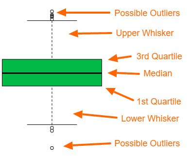 ] --- # Box Plot ## A Box plot .pull-left[ ``` r boxplot(mpg~cyl,data=mtcars, main="Car Milage Data", xlab="Number of Cylinders", ylab="Miles Per Gallon") ``` ] -- .pull-right[ 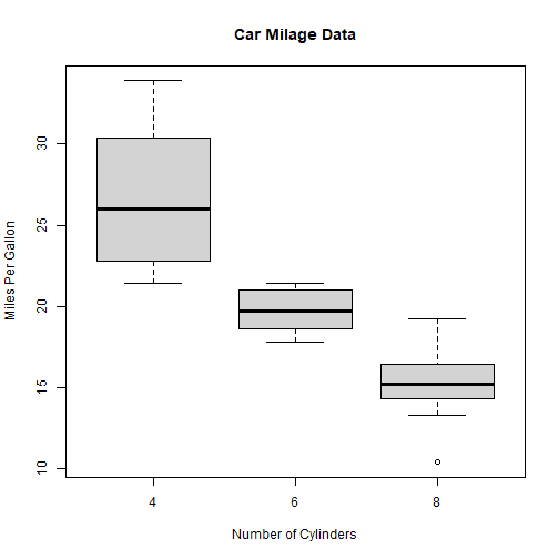<!-- --> ] --- # Box Plot ## Box Plot: Adding color .pull-left[ ``` r boxplot(mpg~cyl,data=mtcars, * col= c("cyan","blue","steelblue"), main="Car Milage Data", xlab="Number of Cylinders", ylab="Miles Per Gallon") ``` ] -- .pull-right[ 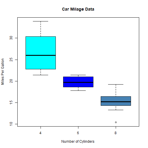<!-- --> ] --- class: inverse, middle, center <!-- background-image: url("images/ggplot.png") --> background-size: cover # .red[THANKS]