class: center, middle, inverse, title-slide .title[ # Data Visualization with <code>ggplot2</code> ] .author[ ### Zulquar Nain ] .institute[ ### AMU ] .date[ ### 2024-04-30 ] --- <style type="text/css"> .code-bg-red .remark-code, .code-bg-red .remark-code * { background-color:red!important; } </style> --- class: inverse, center, middle background-image: url("images/ggplot2.png") background-size: cover # .red[GGPLOT2] --- # INTRODUCTION -- ## `ggplot2`:- a **package** for data visualization -- .pull-left[ ## Simple .center[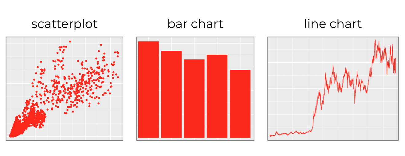] ] -- .pull-right[ ## Complicated .center[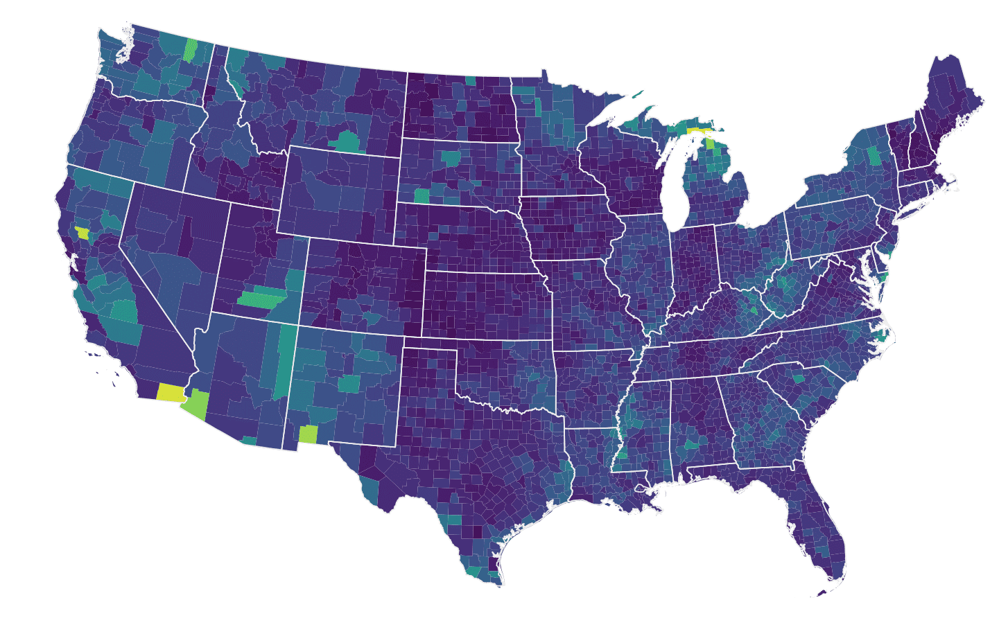] ] -- ## **ggplot2** is the most popular data visualisation R package --- # INTRODUCTION -- - Core function:- `ggplot()` -- - `gg` refers **grammar of graphics** -- - `ggplot2` is highly modular -- - ONE function for ONE work -- - almost every little operation that you want to perform has a separate function -- - like little Lego building blocks that you can snap together --- # .red[INTRODUCTION] -- - `gglpot2` follows layered approach -- - **Layers** and **design elements** are added on top of one another -- - Each command for a **Layer** is added to the previous ones with a plus symbol `(+)` -- - At the end, we have a multi-layer plot object that can be saved, modified, printed, exported, etc. --- # .red[?Help] -- ## Data visualization cheat sheet from ~`R Studio` -- ## [A Layered grammar of graphics by Hadley Wickham](https://vita.had.co.nz/papers/layered-grammar.html) -- ## [The BOOK](https://ggplot2-book.org/mastery.html) -- ## [Another source](https://clauswilke.com/dataviz/references.html) -- ## [The Package](https://www.rdocumentation.org/packages/econocharts/versions/1.0) --- class: center, middle # .green[Basics] -- ## THE GGPLOT2 OPERATES ON `DATAFRAMES` -- ## THE BASICS OF GGPLOT SYNTAX -- .center[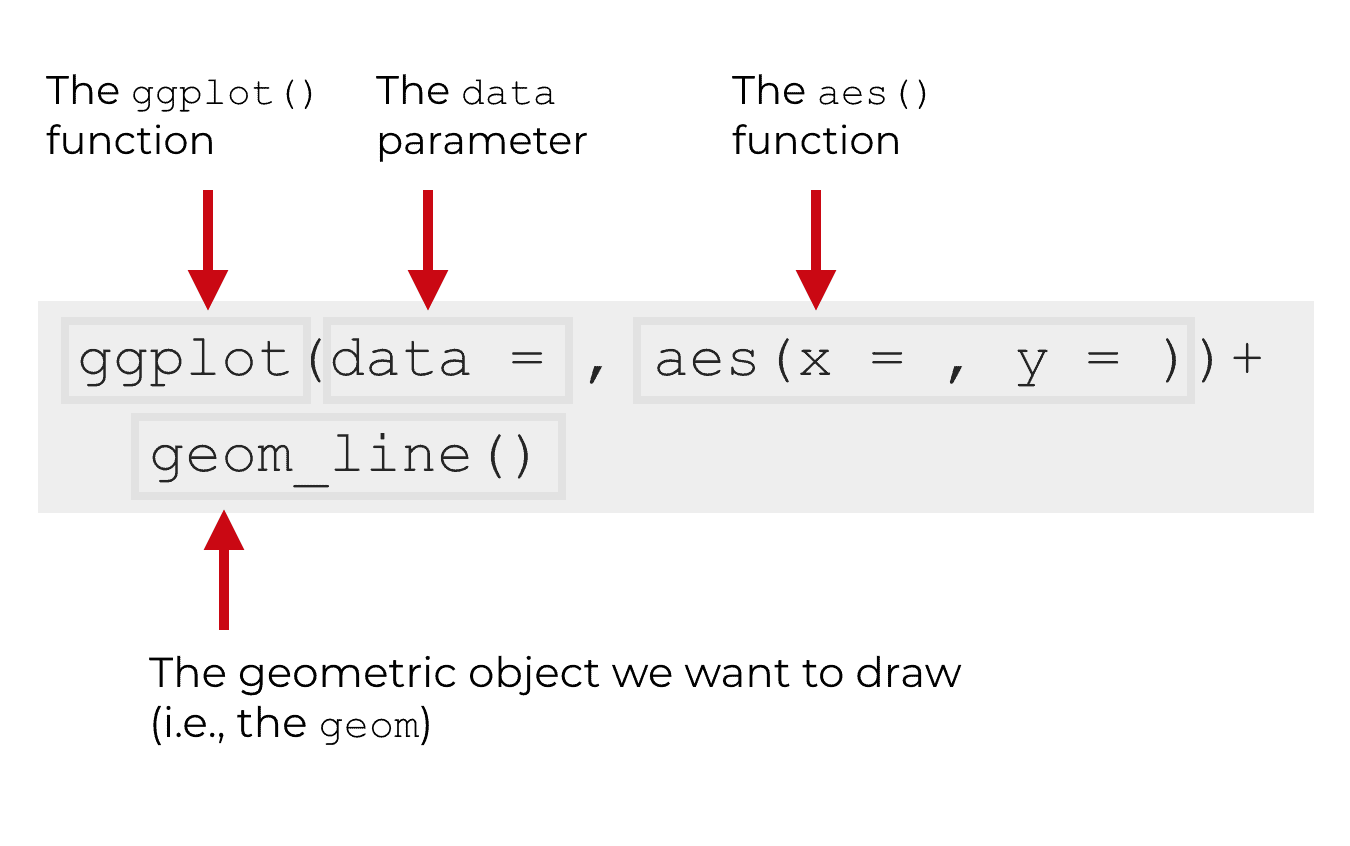] --- # THE SYNTAX -- ## The `ggplot()` function -- ## The ggplot() function is the core function of ggplot2 -- ## Everything else in the ggplot2 system is built “on top of” this function. -- .pull-left[ ```r *ggplot() ``` -- ## Creates a plot area/canvas upon which layers are added ## Ends with `+` ] -- .pull-right[ <img src="Lecture15-GGPLOT2_files/figure-html/unnamed-chunk-3-1.png" style="display: block; margin: auto;" /> ] --- # THE SYNTAX -- ## The DATA parameter -- ## Inside of the the `ggplot()` function, the first parameter is the `data` parameter -- ## The data parameter essentially specifies the `data` that we want to .red[visualize] -- ## .red[Alert]: `ggplot2` works with `data.frame` ONLY --- # THE SYNTAX -- ## The DATA parameter .pull-left[ ```r *ggplot(data=iris) ``` ] -- .pull-right[ output <!-- --> ] --- # GEOMS: GEOMETRIC OBJECTS -- ## **Geoms** are the geometric objects of a data visualization. They are the things that get drawn in a data visualization -- ## On a blank canvas, we add geometrics(shapes) according to a systemic rule representing our `data` -- ## Let's see some example -- .center[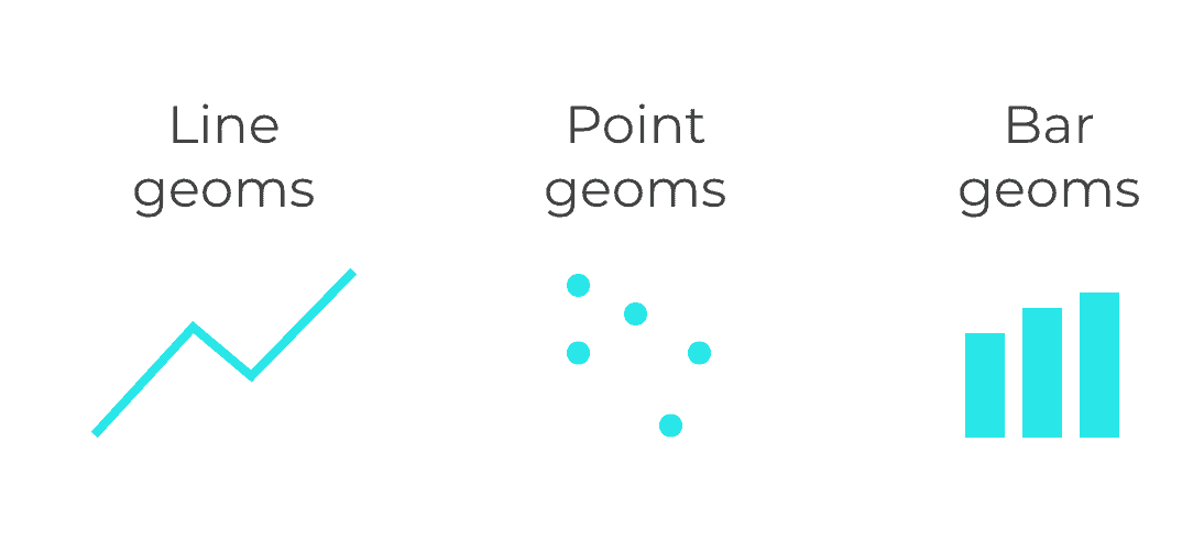] --- # GEOMS: GEOMETRIC OBJECTS -- ## We draw **GEOMS** with `geom_` function -- ## There are many types of `GEOMS`, all starts with`geoms_` -- ## In one plot, we can plot more than one `geoms` by using `+` -- ## .red[GEOMS HAVE ATTRIBUTES LIKE COLOR AND SIZE] -- ### .blue[geoms we draw has attributes like its position in the coordinate system, color, size, shape, etc.] -- ### .blue[For example, point geoms have attributes like color, size, x-position, and y-position] -- ### .orange[ These are known as **aesthetic attributes**. Aesthetic attributes are essentially the visual details about the color, size, and position of geometric objects] --- # THE AES FUNCTION -- ## Now, we have `DATA PARAMETER` & `GEOMS:VISUAL PARAMETERS` -- ## For the data visualization process to work properly, there needs to be a connection between the data (the dataframe) and the visual objects that we draw (the geoms) -- ## But, how do we connect them? -- ## THE AES FUNCTION --- # MAPPINGS FROM DATA TO GEOMS -- ## we need a mapping from the underlying data to visual objects that get drawn (the geoms) -- ## We do this with the `aes()` function -- ## the `aes()` function, basically connects variables in our dataframe to the aesthetic attributes of our geoms -- ## The dataframe is specified by the `data parameter` and the geom is specified by the `geom` that we choose (e.g., geom_line, geom_bar, etc). -- ### The `aes()` function is what enables us to connect these two things. --- # THE AES FUNCTION: AN EXAMPLE -- .left-pull[ ```r ggplot(data = iris , * mapping = aes(x = Sepal.Length , y = Sepal.Width)) ``` ] -- .right-pull[ <img src="Lecture15-GGPLOT2_files/figure-html/unnamed-chunk-7-1.png" style="display: block; margin: auto;" /> ] --- # THE AES FUNCTION: AN EXAMPLE -- .left-pull[ ```r ggplot(data = iris ,mapping = aes(x = Sepal.Length , y = Sepal.Width))+ * geom_point() ``` ] -- .right-pull[ <img src="Lecture15-GGPLOT2_files/figure-html/unnamed-chunk-9-1.png" style="display: block; margin: auto;" /> ] --- # THE AES FUNCTION: A STRUCTURAL EXAMPLE -- #### Let’s say that we want to plot line geoms, that is essentially,want to create a line chart #### Line geoms have aesthetic attributes like their position on the x axis, position on the y axis, and color #### By using the `aes()` function, we can connect the variables in the dataframe to those aesthetic attributes, which will cause the line to vary on the basis of the underlying data. -- ```r *ggplot(data = dummy_data, aes(x = var1, y = var2) + geom_line() ``` -- .center[] --- # THE AES FUNCTION: AN EXAMPLE-.red[`color`] -- .left-pull[ ```r ggplot(data = iris ,mapping = aes(x = Sepal.Length , y = Sepal.Width))+ * geom_point(color="red") ``` ] -- .right-pull[ <img src="Lecture15-GGPLOT2_files/figure-html/unnamed-chunk-12-1.png" style="display: block; margin: auto;" /> ] --- # THE AES FUNCTION: AN EXAMPLE-.red[`shape`] -- .left-pull[ ```r ggplot(data = iris ,mapping = aes(x = Sepal.Length , y = Sepal.Width))+ * geom_point(color="red", shape=5) ``` ] -- .right-pull[ <img src="Lecture15-GGPLOT2_files/figure-html/unnamed-chunk-14-1.png" style="display: block; margin: auto;" /> ] --- # OTHER PLOT AESTHETICS ### - `shape =` Display a point with `geom_point()` as a dot, star, triangle, or square… -- ### - `fill =` The interior color (e.g. of a bar or boxplot) -- ### - `color =` The exterior line of a bar, boxplot, etc., or the point color if using `geom_point()` -- ### - `size =` Size (e.g. line thickness, point size) -- ### - `alpha =` Transparency (1 = opaque, 0 = invisible) -- ### - `binwidth =` Width of histogram bins -- ### - `width =` Width of “bar plot” columns -- ### - `linetype =` Line type (e.g. solid, dashed, dotted) --- # LABELS ## Names of `axes`, `plot titles` etc ## Done within the `labs()` function ## added to the plot with `+` just as the `geoms` ## Within `labs()`we can provide character strings to these arguements: - `x =` and `y =` The x-axis and y-axis title (labels) - `title =` The main plot title - `subtitle =` The subtitle of the plot, in smaller text below the title - `caption =` The caption of the plot, in bottom-right by default --- # LABELS: AN EXAMPLE -- .pull-left[ ```r ggplot(data = iris , mapping = aes(x = Sepal.Length, y = Sepal.Width))+ geom_point(color="red", shape=5)+ labs( title = "Sepal width Vs length", subtitle = "Flower of IRIS species", x= "Sepal Length", y= "Sepal Wdith", caption = "A caption here") ``` ] -- .pull-right[ <img src="Lecture15-GGPLOT2_files/figure-html/unnamed-chunk-16-1.png" style="display: block; margin: auto;" /> ] --- # THEMES ## `ggplot2` is quite flexible and a lot of control over the plot we have. -- ## the design of the plot that is not related to the data shapes/geometries are adjusted within the `theme()` function -- ## For example, the plot background color, presence/absence of gridlines, and the font/size/color/alignment of text (titles, subtitles, captions, axis text…) -- ## These adjustments can be done in one of two ways: - .blue[Add a complete theme `theme_()` function to make sweeping adjustments - these include `theme_classic()`, `theme_minimal()`, `theme_dark()`, `theme_light()` `theme_grey()`, `theme_bw()` among others] -- - .blue[Adjust each tiny aspect of the plot individually within `theme()`] --- # THEMES: Some Example .pull-left[ ```r catter <- ggplot(data=iris, aes(x = Sepal.Length, y = Sepal.Width)) scatter + geom_point(aes(color=Species, * shape=Species)) + labs( title = "Sepal width Vs length", subtitle = "Flower of IRIS species", x= "Sepal Length", y= "Sepal Wdith", caption = "A caption here") + * theme_bw() ``` ] -- .pull-right[ <img src="Lecture15-GGPLOT2_files/figure-html/unnamed-chunk-18-1.png" style="display: block; margin: auto;" /> ] --- # THEMES: Some Example .pull-left[ ```r ggplot(data=iris, aes(x = Sepal.Length, y = Sepal.Width)) + geom_point(aes(color=Species, shape=Species)) + labs(title = "theme_bw()",) + * theme_bw() ``` ```r ggplot(data=iris, aes(x = Sepal.Length, y = Sepal.Width)) + geom_point(aes(color=Species, shape=Species)) + labs(title = "theme_classic()",) + * theme_classic() ``` ] -- .pull-right[ ```r ggplot(data=iris, aes(x = Sepal.Length, y = Sepal.Width)) + geom_point(aes(color=Species, shape=Species)) + labs(title = "theme_minimal()",) + * theme_minimal() ``` ```r ggplot(data=iris, aes(x = Sepal.Length, y = Sepal.Width)) + geom_point(aes(color=Species, shape=Species)) + labs(title = "theme_grey()",) + * theme_grey() ``` ] --- # THEMES: Some Example .pull-left[ <img src="Lecture15-GGPLOT2_files/figure-html/unnamed-chunk-23-1.png" style="display: block; margin: auto;" /> <img src="Lecture15-GGPLOT2_files/figure-html/unnamed-chunk-24-1.png" style="display: block; margin: auto;" /> ] -- .pull-right[ <img src="Lecture15-GGPLOT2_files/figure-html/unnamed-chunk-25-1.png" style="display: block; margin: auto;" /> <img src="Lecture15-GGPLOT2_files/figure-html/unnamed-chunk-26-1.png" style="display: block; margin: auto;" /> ] --- # THEMES: ELEMENTS ### `theme()` can be also modified ### The `theme()` function has a large number of arguments, each of which edits a very specific aspect of the plot. ### The basic syntax is this: - Within `theme()` write the argument name for the plot element you want to edit, like `plot.title =` - Provide an `element_()` function to the argument - Most often, use `element_text()`, but others include `element_rect()` for canvas background colors, or `element_blank()` to remove plot elements - Within the `element_()` function, write argument assignments to make the fine adjustments you desire --- # THEMES: ELEMENTS -- ```r plot + theme_classic()+ # pre-defined theme adjustments theme( legend.position = "bottom", # move legend to bottom plot.title = element_text(size = 30), # size of title to 30 plot.caption = element_text(hjust = 0), # left-align caption plot.subtitle = element_text(face = "italic"), # italicize subtitle axis.text.x = element_text(color = "red", size = 15, angle = 90), # adjusts only x-axis text axis.text.y = element_text(size = 15), # adjusts only y-axis text axis.title = element_text(size = 20) # adjusts both axes titles ) ``` --- # THEMES: ELEMENTS .pull-left[ <!-- --> ] -- .pull-right[ <!-- --> ] --- class: inverse, middle, center <!-- background-image: url("images/ggplot.png") --> background-size: cover # .red[THANKS]